To replace our design with your desired theme. Please do configuration as mention
Path : src > data > layout.json
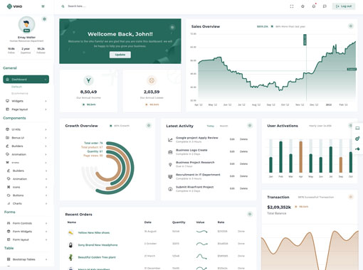
    settings:
           {
                "layout_type":'ltr',
                "layout":'Defaul',
                "sidebar_setting": 'compact-wrapper '
            },
    color:
           {
                "layout_version":'light',
                "primary_color":'#24695c',
                "secondary_color":'#ba895d'
            }
You have 3 Notifications4
Delivery processing
Order Complete
Tickets Generated
Delivery Complete
What's the project report update?
32 mins ago
Send me project code...
58 mins ago
Check your report update...
1 hr ago
Human Resources Department
Follow
Experince
Follower
.btn-pill
.btn-air-*
.btn-lg
.btn-sm
.btn-xs
.active
.disabled
disabled="disabled"
.btn
<button>
<a>
<input>
.btn-outline-*
.btn-outline-*-2x
.btn-*
.btn-*-gradien
Try It Real Time
 Ain Chavez
 Erica Hughes
 Kori Thomas